This latest update is an overhaul of our steps icons to better help users instantly identify their current task and I have to admit it was long overdue 🙂
- New steps icons (see help tab)
- New multi icons for multi tasked steps. eg Killing an NPC to collect item steps will display a combination Kill + Collect icon.
- All steps icons have been adjusted to reflect their appropriate task.
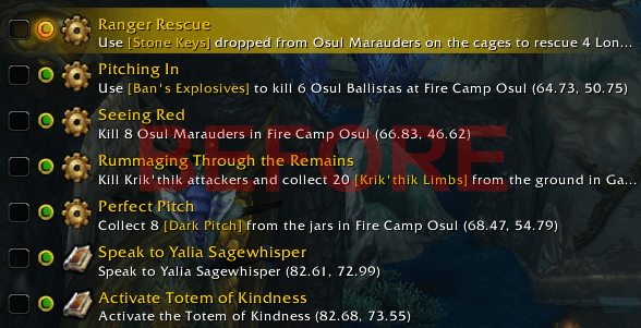
Here is a quick example of the differences

Before the icons were generic and bland… it didn’t really provide you with much indication of what you’re supposed to be doing.
The cog  and book
  icon was over used with many of our quest steps.
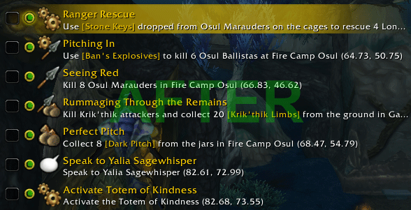
It should be a lot more detailed like this..

Now each icon is matched with the task to instantly describe what you should be doing for each step.

The cog icon suggest a general task that will cover steps that doesn’t involve any combat, looting or speaking to any NPC.

The spear icon is a Kill task and it is used when a step
only require killing an npc to complete.

The bag icon is a Collect or Looting task and it is used when a step
only require collecting an item to complete.

The chat icon is a Speaking task and it is used when a step
only require speaking to an NPC to complete.
To make it more detailed we also added extra icons for steps that involve multiple task eg.

This is a
Kill and Collect icon, eg for the quest
‘Rummaging Through the Remains‘ above involve killing an NPC and collecting an item from the corpse to complete the quest.

This is a
Kill and General task icon which is usually for task that involve using an item to complete.

This is for a step that involve
Speaking and Killing or combat.

For steps that involve using a
vehicle or
mount.

For steps that require
Speaking then using a
Vehicle.

This step is used when you need to accept one or several
Random Daily quest(s) from the NPCs in the area. It will require a manual tick after you accept the quest(s).

The book icon will remain to be used for ‘
As you go..‘ step and also
special notes that will likely require manual ticking for to continue.
All right I hope you find our new icon system straight forward and easy to identify, our goal to always improve the guides and addon in anyway we can.
-Dugi

![]() and book
and book ![]() icon was over used with many of our quest steps.
icon was over used with many of our quest steps.
39 replies to "New Icon System (Build 6.200)"
Dugi, glad to see the overhaul on the icons. It was sometimes difficult to tell what the task requirements were from the step notes. I can’t tell you how many times I killed an NPC and forgot to loot the quest-required item and have to go back for it. This is a great change. Thanks for continuing to make your great guides even better!
Hopefully this will take care of the bug where it displays a cogwheel on a turnin step, etc.
Thz Dugi your giudes are the bomb. Used your guides for many years now. They really helped me alot. Im 63 years old and your guide has saved me tons of time. Keep up the awsome work.I recommend this product highly. Cheers Tooth
Hey dugi good job with the mop seriously thanks, but as it seem when i use the arrow funtion n while flying i notice that ur arrow only has a vertical n when im flying i dont know whether to look up or down as i am flying, can u guys upgrade the arrow pls thanks, other than that the rest impressive at its finests….
Great update Dugi! This will help out a lot.
nice
Love the changes. And I agree with your statement of “Long overdue”. As always, thanks for your GREAT product. 😀
Looks good! 😀
Surpassed yourselves yet again, what are you guys on? apart from dedication skill and determination! well done guys, and once again.
Dugi can i use curse to update my guides
@Brian Cheney, it’s not recommended using curse for updating the guidesviewer. The curse version is without guides and will overwrite you current guidesviewer. Set the curse client to ignore Dugi guides.
I still want to see a feature to show all tasks you need to do to complete all your quest in an area. For example, if you need to kill several mobs to complete one quest, loot something on the ground and speak with NPC within the same area, why showing as separate lines on dugi? You can show only one line that indicate everthing you need to do in this area.
I’m afraid that leveling is now simply too fast 😉
No, seriously. Great work in adding these details. They make a good guide even better.
Thx!
Great edition to your guide as usual.. Keep up the awesome work mate
These are great enhancements. Thank you very much for making such a great guide!!!
Great idea Dugi! Thank you, wywy
Just gets better and better. This is why Dugi has and always will have the BEST GUIDE AVAILABLE.
Thank you ,Thank you Dugi !!!!
You are the best ever <3
You take so good care of your members!!!!!
With love
Arya
After the update, the guide doesn’t show up for me. I even typed /dugi off then /dugi on, but the guide still doesn’t show up. I can get the config page with no problem, but nothig else works. It worked fine until I updated yesterday.
@SlowRunner, is the icon gold? click on the Dugi icon until it set to gold mode so the guides are displayed.
if you don’t see the icon type /dugi reset.
Dugi, as usual, very impressed with how you continuously improve the Guide. Thanks for all the effort; it has made leveling once again enjoyable!
This looks great! Should make leveling That Much FASTER! Now…. if you could fix the frames so that they stay PUT! when I log out and switch toons, the frames are moved and the quest tracking frame ends up behind the mini map. What’s the fix?
@Chetalou, Have you tried the lock buttons under settings/frame?
That worked for me until pet battling yesterday.
@gamer, I suffer from the same problem. As I was attacked directly after the battle, and had the settings set to move the marker to “right selection”, I found myself with openiong the present guide, and of course, died. Same with the Hallow End’s fires where it’s vital to be quick. Repetedly get the Dugi Guide instead of anything else. When I forget to movwe the frame that is. I tried to lock but that only result was that I couldn move the frame back to where it belongs. So I took the lock away. But I’m confident that we wil have a fix on this.
MickeT
@Chetalou, Moving watch frame problem? I fixed it by moving the ElvUI watch frame anchor (assuming you’re using ElvUI) and then clicking on “Reset Frames” in the Dugi Guides settings. Works like a charm now. 🙂